PDF 101: Ten Common PDF Problems

We see a lot of PDFs come through the MagCloud site, and while most of them look great, there are some avoidable issues that pop up every so often. Below are ten common PDF problems that can stand in the way of a great looking print publication.

1. Content is too close to the outside edges.
We see a number of great PDFs that have text placed dangerously close to the trim line.   As we discussed in our design series blog post on trim and bleed, it’s important to keep your content within a safe distance of the trim line to avoid having it cut off in your final print publication. Remember that the trim line is 8.25″ x 10.75″ so you need to design to those dimensions NOT the PDF size of 8.5″ by 11″ that you upload to MagCloud. This 8.5″ x 11″ PDF includes a bleed area that will be trimmed off: 0.125″ on the top, 0.125″ on the bottom and 0.25″ on the outside. Since this trim can vary slightly in either direction, we recommend leaving 1/4 inch of extra space between the 8.25″ x 10.75″ trim line and your content, particularly any text content. This will ensure that even if the trim is slightly off, your content will not get cut off, nor will it appear to have been placed too close to the edge of the page.

2. Images are not extending into the bleed area.
Similarly, we see a lot of PDFs where images that the publisher wanted to extend to the edge of the page stop at the trim line. If the trim is even slightly off in the opposite direction in this case, there will appear to be a thin white edge on the image, as shown in our trim and bleed blog post and below. With that in mind, be sure that any images you want to extend to the edge of the printed page, go all the way to the edge of your 8.5″ x 11″ PDF, filling the bleed area (again, 0.125″ top and bottom, 0.25″ on the outside edge).

3. Content is too close to the spine.
Another “edge” to keep in mind is the inside edge of your PDF, where the spine will be on your printed publication. We often see PDFs with text that starts right next to the spine, and becomes lost when printed with a perfect binding. As we described in our design series blog post on designing for perfect binding, up to 1/4 inch of the inside edge of your page may be lost into the spine on a perfect bound publication. It is important to keep this in mind when designing your PDF, and ensure that none of your content is placed close enough to the inside edge that it is in danger of being lost in the final print.

4. Images are distorted across perfect bound spines (especially faces).
In addition to text disappearing into a perfect bound spine, we also see PDFs that have images going across the center spine such that the resulting print appears to be missing up to a half inch in the center of the image due to the perfect binding. As described in our perfect binding blog post, as well as on our Getting Started page, this can be avoided by making the two halves of one image into two separate images within the document, then moving them both out from the spine slightly and duplicating the opposing image within the resulting gutter space. Another trick is to avoid placing the focus of an image on the spine, which will draw attention to this disappearing act and make it more obvious to the viewer. If the focus is moved away from the center spine, any loss of content into the spine area will be less noticeable.

5. PDF uses low resolution images.
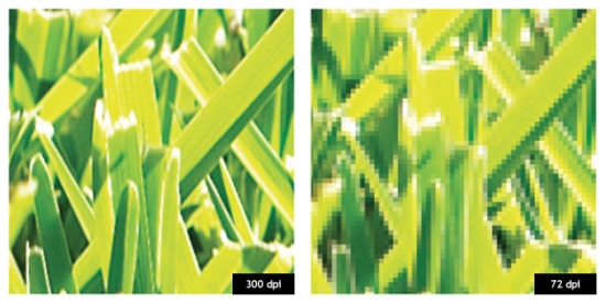
While the placement of images is one thing that can cause problems in a print copy, the image itself can be the problem. We often see are PDFs that use lower resolution images, and although they look good on screen, they end up looking pixelated in print. As we describe in our design series blog post about getting the most out of your images, screen resolution is 72 pixels- or dots-per-inch (dpi) but print resolution is 300 dpi. Therefore, when selecting images for your publication, they should be at least 300 dpi to ensure a quality print out. As a test to see if your images will look good in print, open your PDF on your computer screen and zoom in to 300%. If the images still look crisp then, they will look good in your printed copy. On the other hand, if they look pixelated (like they are made up of little blocks of color) then your image is too low res, and will end up looking fuzzy in your final printed copy.

300 dpi vs 72 dpi at 350% zoom

6. Color profiles are not embedded.
Another common image problem we see in PDFs deals with the color of the resulting print copy. As we explained in our design series blog post on working with color, HP Indigo presses print MagCloud publications in a 4-color CMYK process, but most images that get used in the PDF have an RGB colorspace. To help guide this conversion from RGB to CMYK, it is important that the color profiles for these images are embedded in the PDF. Without them, the color of the printed images may appear to be slightly off. To make sure that you are using the best color settings possible when creating your PDF, we encourage you to follow the program-specific instructions that are available for download from the bottom of our Getting Started page.

7. Fonts are not embedded.
Of course, color profiles aren’t the only things that need to be embedded in your PDF – any fonts you use also should be included. A common error that occurs in our PDF upload validation is non-embeddded fonts. This can again be avoided by following the downloadable instructions on our Getting Started page for the software you are using to design your PDF. Each of these guides provides settings that will ensure your fonts are properly embedded in your final PDF, and help you avoid this upload error.

8. Fonts are too small or illegible.
In addition to the technical issue of non-embedded fonts, in some cases the problem with a PDF stems from the fonts themselves being too small or illegible, making the text difficult to read in the final print. For body copy we recommend 9-12 point type and for headlines 18 points or higher.  As we discussed in our design series blog post on typeface dos and don’ts, you also want to avoid hard-to-read fonts, particularly for large blocks of text. Decorative fonts are great as headers, but can detract from your message when they become difficult to read.

9. Dark text is used on a dark background, or light text is used on a light background.
Even in cases where the font is legible, we’ve seen PDFs where the color of the text doesn’t provide enough contrast with the background. Placing navy blue text on a black background or light yellow text on a white background, as shown below, becomes very difficult to read. When there is not enough contrast between the text and the background like this, the text seems to blend in and disappear from view, taking the message it was intended to convey with it.

10. A light spine is used with a dark cover, or a dark spine is used with a light cover.
Finally, while you want your text to stand out, it’s a whole other story when it comes to your spine. We occasionally see PDFs that have dark covers and light spines, or vice versa, which makes the slightest shift in the spine placement become glaringly obvious. As we discussed in our perfect binding design blog post, we encourage you to pick a spine color that is close to the color of your front and back covers. Doing so will give a more seamless appearance to your final print publication, and ensure a more polished look with every print.

To help avoid these problems in your PDF, be sure to follow the program-specific instructions available for download on our Getting Started page when designing your publication. For some more resources to help design your PDF, check out our design series blog post on layouts and templates, or browse through some of our featured publications on the MagCloud website for inspiration.

Does your publication successfully avoid these ten common problems? Share a link to it in the comments below!

Designing For Perfect Binding

After you upload your PDF to MagCloud, if it is over 24 pages you will have the option to select perfect binding for your print version. Although MagCloud uses the same PDF for saddle stitch and perfect bound publications, if you plan to choose perfect binding there are a few things that are good to keep in mind while you are designing your PDF.

Content Near The Spine
Saddle stitch binding allows your printed copy to lay flat when it is opened, allowing all content up to the inside edge of your PDF to be visible in the final print copy. Perfect bound publication are glued at the spine which results in approximately a quarter inch of the inside edge of your pages to be less visible because a perfect bound print cannot lie flat without breaking the spine. Therefore, it is good to account for an extra 0.25 inches of margin on the inside edge of your publication when placing text and images on the page, keeping in mind that anything within this 0.25 inches, also referred to as the gutter, may be lost into the spine in the final print.

Images Across Two-Page Spreads
The gutter can be troublesome when you want to place an image across the center spine of your publication. When an image covers two pages, the inside 0.25 inches on both pages will be obscured, which amounts to a half of an inch in the center of the image. This is enough to cause a full person to disappear in a larger group photo, or obscure a subject’s nose in a centered portrait. The best way to account for this is to shift the image outward on both pages so that it is duplicated inside the gutter (shown within the pink lines in the diagram below). Doing so will create the appearance of a continuous image across both pages in spite of the binding.

It’s also a good rule of thumb to avoid centering the focus of your image directly on or near the spine in a perfect bound publication. This disappearing act will be much less obvious if your eye isn’t drawn to it, as shown in the layout on the right versus the one on the left below.

Designing a Spine
Another design aspect to think about with perfect bound publications is the spine. After you upload your PDF to the MagCloud site and select perfect binding, you’ll have the option to pick a color for your spine or upload your own design. In either case, it’s a good idea to pick colors and designs for your spine that are the same or very close to the front and back covers of your publication. Just as the trim of your print copy can vary slightly, so can the placement of the spine, and this will be far more obvious if you have selected a white spine with a dark cover. Choosing a spine color that closely matches your cover or continuing an image from the front or back covers will ensure that your printed publication has a professional appearance every time.

Do you have a good-looking perfect bound publication design that you’d like to show off, or any tips of your own to share? Tell us about it in the comments below!

Working With Color

In the world of traditional printing, getting the right color in the right place on the page is something of an art form, done by overlapping layers of ink in just the right quantities using carefully positioned aluminum plates. In a digital world of backlit screens, color is a more technical process, using the spectrum of visible light to produce the desired color output. When these two worlds collide for digital printing, colors must undergo a transition from how they are displayed on screen to what gets printed on the page.

To help you design your MagCloud PDF so that this transition is as accurate as possible, first let’s get back to basics.

RGB vs CMYK
A lot of acronyms get thrown around when you start talking about color, the most common being RGB and CMYK.

RGB stands for Red-Green-Blue, and is an additive color model based on combining red, green and blue light, as shown in the color chart on the left below. RGB is the color model used by most digital devices, including your computer screen and the images produced by your digital camera.

RGB vs CMYK

CMYK stands for Cyan-Magenta-Yellow-Key (ie, black), and is a subtractive color model based on layering cyan, magenta, yellow and black ink to selectively subtract the amount of light reflected off the page, as shown in the color chart above right. CMYK is also commonly referred to as 4-color process, and is the color model used for color printing both on traditional presses and on the HP Indigo digital presses used to print MagCloud publications.


From An RGB Monitor To A CMYK Print Copy

When your MagCloud PDF is sent to an HP Indigo digital press for printing, the press will convert any non-CMYK content to CMYK prior to printing. The press does this conversion automatically based on the color profiles that have been embedded in your file. If there are no color profiles embedded in your file, this conversion will be based on the default color settings of the press, which could result in a color output that is different from what you see on screen.

Therefore, to ensure you get the best output possible, we encourage you to follow these color guidelines when creating and inserting content in your MagCloud PDF:

• Images you place into your document, whether from a digital camera or stock photography website, should be left in their original color space (sRGB, Adobe RGB, etc) with the corresponding color profiles embedded in the final PDF.*

• Text and other vector components (ie, backgrounds, blocks of color, etc) that you create in the document should be CMYK, with black text set to 100% K (CMYK = 0, 0, 0, 100).

*For specific information about embedding color profiles in your design program of choice, be sure to check out our Getting Started page.

Have any other color tips to share from your MagCloud publishing experience? Let us know in the comments below!

Get The Most Out Of Your Images

They say a picture is worth a thousand words, but if that picture is grainy or squished, it’s not going to be saying anything good. To help you include images that speak volumes in your next MagCloud publication, this installment of our Design Blog Series includes a short list of image DOs and DON’Ts:

DON’T use images copied off a website
Aside from the potential copyright issues associated with taking images off of websites, photos used on the web are almost always screen resolution, or 72 pixels per inch (ppi, or more commonly, dpi). This is roughly a quarter of the 300 pixels per inch that is the recommended resolution for printing. If you use an image less than 300 dpi in your MagCloud publication, you run the risk of getting a noticeably pixelated, or ‘fuzzy-looking’ image in the print copy.  The lower the resolution of your image, the more noticeable the pixelation will be, so a 72 dpi image off the internet will look very ‘fuzzy’ in print.

DO use images from your camera or stock photography websites
Images taken with a personal camera or purchased from a stock photography website like iStockphoto will generally be high enough resolution for printing.

An easy way to check if your images are high enough resolution for printing is to open your final PDF and zoom in to 350% on-screen. If an image still looks clear at 350% zoom, like the 300 dpi image on the below left, then this image will look great in your printed copy. If an image looks pixelated at 350%, like the 72 dpi image shown below right, then it will likely look pixelated in your print copy too.

300 dpi vs 72 dpi at 350% zoom

It’s also good to keep in mind that if you double the size of an image, the number of pixels per inch will drop by half. This is because doubling the size of an image doesn’t change the number of pixels in the image, it just increases the number of inches that the pixels have to fill. For example, if you have a 1” x 1” 300 dpi image, which is 300 pixels by 300 pixels, doubling it in size to 2” x 2” means that there are now 300 pixels for every 2 inches, making it a 150 dpi image.

DON’T squish or stretch your images
You have a rectangular photo, let’s say 4” x 6”, but you want it to be square in your MagCloud publication. Sound familiar? One solution would be to just squish or stretch the rectangular image into the square size you want, but here is the inevitable result:

Stretched/Squished Example

DO scale and crop your images
To avoid squishing and stretching the subjects of your photos, the better option is to use scaling and cropping to resize your images. Scaling your images maintains their aspect ratio (the ratio between the width and height of the image), keeping a rectangular image as a rectangle, then the image can be cropped (i.e trimmed) down to the size you want, like so:

Scale/Crop Example

In Adobe InDesign, QuarkXpress, Microsoft Publisher and Apple Pages, you can crop images by creating an image placeholder in the size you want, and then placing your image into the placeholder. These programs allow you to adjust the image independently of the placeholder, and the placeholder will “crop” the image in your final publication. In Microsoft Word and Microsoft Publisher, you can use the Crop Picture feature to manually crop the image itself down to the size that you want. Both methods will help you avoid stretching or squishing your subjects.

DON’T use images that are really dark with low contrast

Your computer screen is brightly back-lit, but unfortunately print publications are not. As a result, details that are dark or low contrast on screen may not be as visible in your printed copy. Overall, you can expect the print you receive to appear darker than what you see on screen, so it’s best to avoid using darker images or those with very low contrast to begin with. If you want to try lightening or increasing the contrast in your images in a photo editing software like Photoshop, check out these photo retouching tips and tricks.

DO embed your color profiles

To get the closest representation in your print copy as compared to what you see on screen, make sure that you embed the original color profiles of your images in the final PDF. We’ll dive more into detail on this next week in a post on color, but in the meantime check out our Getting Started page for downloadable instructions on how to do this in your design program of choice.

We would love to hear your favorite tricks for getting your images to standout. Please post them in the comments section below.