We see a lot of PDFs come through the MagCloud site, and while most of them look great, there are some avoidable issues that pop up every so often. Below are ten common PDF problems that can stand in the way of a great looking print publication.
1. Content is too close to the outside edges.
We see a number of great PDFs that have text placed dangerously close to the trim line. As we discussed in our design series blog post on trim and bleed, it’s important to keep your content within a safe distance of the trim line to avoid having it cut off in your final print publication. Remember that the trim line is 8.25″ x 10.75″ so you need to design to those dimensions NOT the PDF size of 8.5″ by 11″ that you upload to MagCloud. This 8.5″ x 11″ PDF includes a bleed area that will be trimmed off: 0.125″ on the top, 0.125″ on the bottom and 0.25″ on the outside. Since this trim can vary slightly in either direction, we recommend leaving 1/4 inch of extra space between the 8.25″ x 10.75″ trim line and your content, particularly any text content. This will ensure that even if the trim is slightly off, your content will not get cut off, nor will it appear to have been placed too close to the edge of the page.
2. Images are not extending into the bleed area.
Similarly, we see a lot of PDFs where images that the publisher wanted to extend to the edge of the page stop at the trim line. If the trim is even slightly off in the opposite direction in this case, there will appear to be a thin white edge on the image, as shown in our trim and bleed blog post and below. With that in mind, be sure that any images you want to extend to the edge of the printed page, go all the way to the edge of your 8.5″ x 11″ PDF, filling the bleed area (again, 0.125″ top and bottom, 0.25″ on the outside edge).

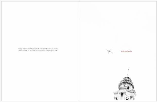
3. Content is too close to the spine.
Another “edge” to keep in mind is the inside edge of your PDF, where the spine will be on your printed publication. We often see PDFs with text that starts right next to the spine, and becomes lost when printed with a perfect binding. As we described in our design series blog post on designing for perfect binding, up to 1/4 inch of the inside edge of your page may be lost into the spine on a perfect bound publication. It is important to keep this in mind when designing your PDF, and ensure that none of your content is placed close enough to the inside edge that it is in danger of being lost in the final print.
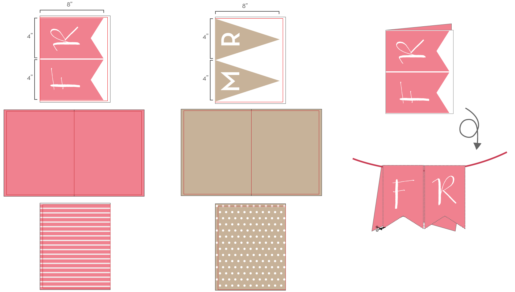
4. Images are distorted across perfect bound spines (especially faces).
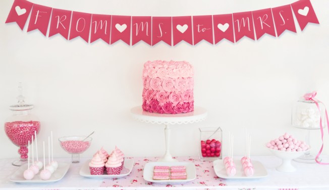
In addition to text disappearing into a perfect bound spine, we also see PDFs that have images going across the center spine such that the resulting print appears to be missing up to a half inch in the center of the image due to the perfect binding. As described in our perfect binding blog post, as well as on our Getting Started page, this can be avoided by making the two halves of one image into two separate images within the document, then moving them both out from the spine slightly and duplicating the opposing image within the resulting gutter space. Another trick is to avoid placing the focus of an image on the spine, which will draw attention to this disappearing act and make it more obvious to the viewer. If the focus is moved away from the center spine, any loss of content into the spine area will be less noticeable.
5. PDF uses low resolution images.
While the placement of images is one thing that can cause problems in a print copy, the image itself can be the problem. We often see are PDFs that use lower resolution images, and although they look good on screen, they end up looking pixelated in print. As we describe in our design series blog post about getting the most out of your images, screen resolution is 72 pixels- or dots-per-inch (dpi) but print resolution is 300 dpi. Therefore, when selecting images for your publication, they should be at least 300 dpi to ensure a quality print out. As a test to see if your images will look good in print, open your PDF on your computer screen and zoom in to 300%. If the images still look crisp then, they will look good in your printed copy. On the other hand, if they look pixelated (like they are made up of little blocks of color) then your image is too low res, and will end up looking fuzzy in your final printed copy.

6. Color profiles are not embedded.
Another common image problem we see in PDFs deals with the color of the resulting print copy. As we explained in our design series blog post on working with color, HP Indigo presses print MagCloud publications in a 4-color CMYK process, but most images that get used in the PDF have an RGB colorspace. To help guide this conversion from RGB to CMYK, it is important that the color profiles for these images are embedded in the PDF. Without them, the color of the printed images may appear to be slightly off. To make sure that you are using the best color settings possible when creating your PDF, we encourage you to follow the program-specific instructions that are available for download from the bottom of our Getting Started page.
7. Fonts are not embedded.
Of course, color profiles aren’t the only things that need to be embedded in your PDF – any fonts you use also should be included. A common error that occurs in our PDF upload validation is non-embeddded fonts. This can again be avoided by following the downloadable instructions on our Getting Started page for the software you are using to design your PDF. Each of these guides provides settings that will ensure your fonts are properly embedded in your final PDF, and help you avoid this upload error.
8. Fonts are too small or illegible.
In addition to the technical issue of non-embedded fonts, in some cases the problem with a PDF stems from the fonts themselves being too small or illegible, making the text difficult to read in the final print. For body copy we recommend 9-12 point type and for headlines 18 points or higher. As we discussed in our design series blog post on typeface dos and don’ts, you also want to avoid hard-to-read fonts, particularly for large blocks of text. Decorative fonts are great as headers, but can detract from your message when they become difficult to read.
9. Dark text is used on a dark background, or light text is used on a light background.
Even in cases where the font is legible, we’ve seen PDFs where the color of the text doesn’t provide enough contrast with the background. Placing navy blue text on a black background or light yellow text on a white background, as shown below, becomes very difficult to read. When there is not enough contrast between the text and the background like this, the text seems to blend in and disappear from view, taking the message it was intended to convey with it.

10. A light spine is used with a dark cover, or a dark spine is used with a light cover.
Finally, while you want your text to stand out, it’s a whole other story when it comes to your spine. We occasionally see PDFs that have dark covers and light spines, or vice versa, which makes the slightest shift in the spine placement become glaringly obvious. As we discussed in our perfect binding design blog post, we encourage you to pick a spine color that is close to the color of your front and back covers. Doing so will give a more seamless appearance to your final print publication, and ensure a more polished look with every print.
To help avoid these problems in your PDF, be sure to follow the program-specific instructions available for download on our Getting Started page when designing your publication. For some more resources to help design your PDF, check out our design series blog post on layouts and templates, or browse through some of our featured publications on the MagCloud website for inspiration.
Does your publication successfully avoid these ten common problems? Share a link to it in the comments below!


 Pup Culture
 Spot Magazine
 Animals Voice