Get With the Program

Planning for an event can sometimes be, well, eventful. There are always changing schedules to deal with, speakers canceling at the last minute, and 11th hour edits to the program. Making it to press in time (sometimes weeks before the event) with all of these adjustments can be nearly impossible. So, why not lighten your load and use MagCloud?

With fast print turn-around times (as fast as 3-business days for some orders) and great digital options, you could have your next event’s program done quickly, printed beautifully and even offer a digital option to attendees who would rather have their program on their mobile device.

Whether you are planning an internal training day for 10, a corporate meeting for 100 or a conference for 1,000+, MagCloud makes it easy to publish a program with just a few clicks of the mouse and have prints delivered straight to the event location. How easy is that?!

Need shipping that fits your budget? Use the MagCloud pricing calculator to figure out what level of shipping option works best for you.

To help you get started, we have 3 basic templates for Adobe InDesign (CS3 and later) Microsoft Word, and Apple iWork Pages. You can also find templates for sale online from many sites, but be cautious that many of them will require some tweaking to output for print through MagCloud. Please see our How to Guides for details on MagCloud-ready settings.

Ready to design on your own? Get inspired by other publishers’ event and sports programs and agendas on MagCloud:


Put MagCloud to Work: Publish a Business Brochure

A wise person once said ‘You never get a second chance to make a first impression’. In fact, it just takes a few seconds or a cursory glance for a person to make a judgment about us. Our subsequent actions, behavior and professionalism may change that perception slightly, but not to a great extent.

So it stands to reason that how you portray your business to prospective clients is almost as important as how you do business.

Whether you are a fashion designer, a multi-media training company, an industry consultant, a yoga studio, or a niche photographer, putting your brand out there in a professional manner is extremely important.

One could argue that a brochure is just as important as your business card. It is an important marketing and sales tool, one in which you can do a little bragging and shamelessly present your business in the most positive light. It is your opportunity to create a lasting impression, so be sure that it is a good one.

Whether you are a company with a staff of 2, 20 or 20,000, MagCloud is a great tool for affordably publishing and distributing your brochures in a professional format. Our full-color, full-bleed print options in both standard and digest trim sizes give you the choice to create a robust brochure of multiple pages, or something simple and portable, like a four-paged digest handout. Digital distribution options also make it easy to share your brochure digitally to a desktop, laptop, the iPad, or other mobile device.

MagCloud’s ship-to-group feature makes it easy to drop-ship seasonal information or annual brochures to your clients around the world. Or, if you are a small business, its on-demand functionality means that you can distribute individual copies as needed to interested clients, allowing you to maintain a professional appearance without exceeding a limited budget.

Once you have these great logistics and beautiful print quality, the only thing holding you back is content, and design. Here are a few tips for gathering the content you should include in your brochures, and how to effectively assemble it into a professional-looking publication.

Getting Started:

Who are you talking to?

The first thing you need to know is what you want your brochure to accomplish. That ties directly into the target audience and what the message of the brochure will be. Identify your target audience and speak directly to them. Never try to address everyone. Once you know who your audience is, it will be easier to target your messaging and articulate that your product or service is a solution to their needs.

What is your message?

Always include a meaningful headline. Your headline should clearly communicate your main point so that even if the reader reads nothing else, they will understand what you are about.

Tell the whole story in your writing. Be concise, but remember to write your body copy in plain English. Don’t use jargon or industry lingo, instead pretend you’re explaining your message to a friend.

It’s helpful to use succinct, pithy copy. Avoid long sentences. Keep your message to the point. Use subheadings liberally, as they break up long copy and help draw a reader through the text. Ideally, a reader should be able to get a good grasp of your message by reading only the headings and subheadings.

Designing Your Brochure: 

When all of your information is gathered and your writing is done, you can finally get down to the business of designing. You’ll want take into account the basic elements of good design – organization, consistent styling, balance, color, and so on.

Lay out your brochure cleanly and professionally. The design should draw the reader in and ease the process of reading. Remember that erring on the simple side will be easier for your consumer than an over-designed, distracting or hard-to-read brochure.

It’s great to use graphics to provide balance with text, but be sure they are relevant to your content. Use graphics that grab your reader’s attention and underline your message. Whether it’s a picture, logo, or stock image, just be sure it relates to your message and brand.

As with any design there are some things you’ll want to avoid. These include:

  • Avoid over-used typefaces, such as Arial and Helvetica. Read more in our recent blog post.
  • For content type, keep the point size under 12.
  • Don’t use more than three type faces in a brochure.
  • Generally don’t use more than one alignment.

If you feel lost…

Starting from scratch on a brochure can be challenging. Some great resources for design inspiration can come from other designs. Try searching the web for brochures in your industry and see how your design stacks up against the competition. You don’t want to copy someone else’s design, but it’s a great way to get inspired.

Also check out the stock templates available within most design and word-processing software. If you aren’t a super-savvy designer using InDesign or Quark, you’ll be amazed what you can do with Apple iWork Pages, Microsoft Word, and Microsoft Publisher. For those who are confident in their skills with the software, but looking to get a more professional look, you can also investigate altering templates from Stocklayouts or Inkd, just be sure you are ready to tweak these designs as they are not all perfectly sized for output through MagCloud.

Have you published your company’s brochure through MagCloud, or found other great resources for inspiration and design? Please share them in the comments below.

The Space Between

No matter what sort of document you’re planning to publish through MagCloud, it’s important to understand the role that white space plays in your design’s aesthetics.

White space, also known as negative space, is the unused space between text and graphic elements within a publication. It gives the eye a place to land and rest, and implies significance to the content you place on a page.  Some would argue that this empty space is as important as the text and graphic images of a page and that it can make, or break a design. So let’s explore why it’s so important.

Balance and Harmony in Print Design
White space is an integral element of design, as it enables a state of balance to exist between the design objects. It also plays an active role in the effectiveness of a layout; it can highlight important elements and support the overall hierarchy, leading the viewer around the page as the designer intended. The empty space on a page can be every bit as important as the space occupied by graphic elements, and thoughtful use of white space can give a page a timeless, tasteful, and professional appearance.

Check out this example below of a Small Business Brochure that has been reworked to better showcase their photography while still including valuable messaging.

Balance and Harmony in Print Design
Give your photos room to breathe. Highlighting photography doesn’t mean you have to fill a page edge-to-edge with your image. Leaving empty space near an image leaves room for the consumer to pause and use their imagination beyond the frame. The second layout has the same written content, and even had room for a 3rd photo.
 

De-clutter Your Page to Get Your Message Across
Clutter on a page is a lot like clutter in a room–it’s distracting and can overwhelm you, or in this case can overwhelm your reader. But when space is at a premium, white space is often abandoned in order to get as much information on the page as possible. It’s important to keep in mind that a page crammed full of text or graphics with very little white space runs the risk of seeming busy, cluttered and in turn difficult to read. It can also cheapen the overall image you are trying to portray.

Large blocks of text, with little breathing room, tire the eyes much more quickly than those that are adequately spaced with healthy kerning (spacing between characters) and leading (spacing between lines of text). A crowded layout runs the risk of being overlooked by readers simply because it puts strain on their eyes, and in turn, their patience.

With that in mind, when you are designing your next publication, keep in mind a goal of making the end viewing experience as easy and pleasant for your readers as possible. Just like you would tidy your house for guests, de-clutter your pages to make them inviting for your readers, helping them feel more relaxed and encouraging them to spend time lingering over your content.

Use White Space to Convey Your Message
Step away from the edge. Asymmetry and putting content on the margin, when done deliberately, can have a powerful effect on the reader, but when overdone, it can leave the reader feeling on edge. Text that gets too close to the edge of a page can leave the reader feeling like they are going to fall off the page. What’s worse? If you play it too close, content could get trimmed off during the binding process. In this example above, we re-worked the layout and narrowed the columns to make it easier to read.
 

Focus on the Negative, Just This Once
There aren’t many situations in life where focusing on the negative is a good thing, but when it comes to print design, you’ll find it can lead to positive results. Take a look through your favorite magazines to see which designs strike a chord with you more frequently. Chances are, you’ll notice a theme. You may start to notice that highlighting and separating text and graphics with white space imparts more value to content.

After you’ve explored other print designs with this focus on the negative space, be sure to revisit some of your own designs, we’re sure you’ll find ways to tidy up and balance your content with a little more breathing room.

Focus on the Negative
Which would you rather read? When dealing with text-heavy content, you don’t need to fill the page from margin to margin with tiny, single-column text. Take a step back and look at the page from afar. Does the content look digestible? Ask yourself “Would I want to read that?” Narrower columns are easier to read than wide ones that span an entire page. 
 

Get Inspired by Other MagCloud Publishers
For more great examples, check out these MagCloud publishers who really know how to use white space to their advantage:

Hacker Monthly
Snapixel Magazine
Stumble

Think you have an exemplary use of white space in your MagCloud publication?
Share it in the comments section below!

The Importance of Layouts and Templates

Whether you’re a design newbie, or a seasoned veteran, sitting down to create a new publication can be a daunting task. There’s nothing more frustrating than staring at a blank page, feeling stuck, and unsure of where to begin. It’s often easier to change things that don’t work for you, than to completely start from scratch, which is why we suggest starting with an existing document. It can be the design of a similar publication, or a simple template that has preloaded margins, column guides and style sheets, that you can quickly adjust for a head start. The advantage of dong this, it that the basics of the page are already in place so you can focus on your content and styling.

Why use a template?

Whether you are creating a 12-page or 120-page publication, if you plan to create a series with the same style, you’ll definitely want to invest the time to develop style sheets, and come up with a few layouts that you can repurpose each time you publish. This will help you keep a visual consistency not only throughout each publication, but also from publication to publication over time.

Some of our publishers have done a great job of this, and you can see how it helps reinforce their brand to have consistent styling throughout each publication.  Check out a few issues of Hacker Monthly or Livestrong, or portfolios by professional photographer David Livingston and you will see what we mean. Each of these publishers have developed a consistent style using templates that is unmistakably and identifiably their own.

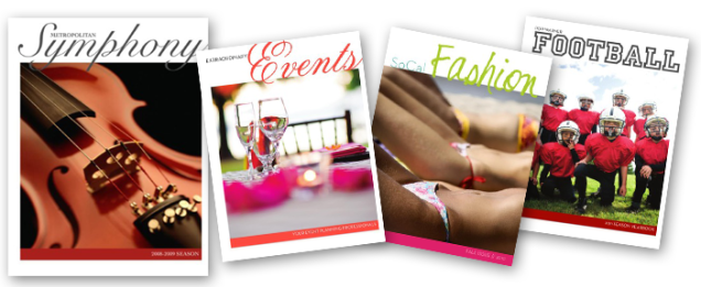
Not an expert at design? No problem. Using a professional-looking template can increase your credibility, and make any publisher look like a pro. Find a template that has a style that resonates with you and use it as a springboard to get yourself started. You can see some great examples of this in our blog post Easy Design with Templates in Apple’s [iWork] Pages, where we turned a basic Symphony Program into a business services guide for an event planning company, a sports team yearbook, and a fashion magazine, with just a few changes in font, colors and photography.

Finding Templates
Where to look and what to look for…

Some software comes equipped with built-in templates, and you can also find great free and paid templates online at the companies’ websites, like Microsoft has for Word and Publisher here, or Adobe has for InDesign at Adobe.com

Still can’t find what you need? Other resources exist where you can buy specific designs for your needs and many of these sites make their templates available for a variety of design programs like Inkd and Stocklayouts.com.

When picking your templates, there are a number of things to consider for your publication:

1. Is this template for an 8.5″ x 11″ document? If it’s designed as a 17″ x 11″ spread, do I know how to adjust it to the right size?

2. What sort of page-layouts are included in the template?

3. Does the template have the right ratio of graphics to text for my needs?

4. Are there hidden layouts that I don’t see? * Hint: if you are using iWorks Pages, there probably are!

5. Does the style suit the audience I am trying to reach? If not, is it easily changed with a few font/color tweaks?

6. Don’t feel restricted by the stock photography or color palette used in a template. Keep in mind our example of the Symphony Program being transformed into a fashion magazine or an event planner’s business collateral

7. Ask yourself, “This template isn’t designed for my specific use-case, but does the overall layout and feel fit my purpose? Could I transform it into something that works?”

Ready to customize your template?
A few tips for making any template fit your needs.

– Unless you get a template directly from our blog, you will likely have to alter some of their settings to accommodate MagCloud’s printing requirements. Before you start making any edits to your template, be sure the document settings match those in the MagCloud Help Section.

– When you make changes to fonts and colors, always do this by editing the font or paragraph style sheets. This way, if you don’t like a change that you have made, it will be easy to adjust and will change that style use on all of the pages of the template.

– Always start with the original file and make 2 or 3 versions, each with different fonts or colors. Then save each as it’s own template so that you can compare them and easily decide which one you like best.

Ready, Set, Start Publishing!

Now that you have your template selected, it’s up to you to make it your own. Need a bit of extra help? Check out our other Tips & Tricks blog posts, or visit the help sections of your software’s site. Many of them have great how-to resources and videos to help you on your way.

Adobe InDesign

Microsoft Office

iWorks Pages

Trim, Bleed and All That Jazz

One of the trickiest things about designing for print is understanding trim size and all things related to it.

After the printed pages come off our presses and are bound together, they need to be “trimmed” so that each page is exactly the same size.  This ensures each page in your publication is even, giving it that professional look.

While we always try to trim as accurately as possible, it’s natural for the trim line to vary slightly in one direction or the other, which is why we recommend that you include a “bleed” and work within a “safe zone” when you design your PDF.

Bleed

To ensure that no important parts of the page are cut off in the trimming process a “bleed” area is defined.  The “bleed” extends beyond the “trim” for when you want a photo or color to extend to the edge of the page.  For Standard, Digest, and Digest Landscape publications, the bleed is the top 0.125 inches, the bottom 0.125 inches, and the outside 0.25 inches of your PDF. For Flyer publications, the bleed is the 0.125 inches on all sides of the 8.5″ x 11″ PDF.

The reason to include a bleed in print files is to ensure that images you want to go to the edge of the page always do so, regardless of how exact the trim is.  If an image is cropped at the 8.25” x 10.75” trim edge on a Standard size publications, as shown in the below diagram on the left, and the print is trimmed slightly wider, then there will be a white bar between the printed image and the edge of the page.  If the image is extended all the way to the 8.5” x 11” PDF edge instead, filling the bleed area as shown in the below diagram on the right, then the printed image will go all the way to the edge of the page regardless of where the actual trim occurs.

Safe Zone

The “safe zone” is the area inside the trim line where your text and graphics are not at risk of being cut off or lost into the binding in the final print, regardless of any variation in the trim.  For MagCloud publications this area is 0.25 inches within all sides of the trim edge.

Any content that you want to appear completely within the final printed publication should be kept inside the safe zone.  Placing content too close to the top, bottom or outside edge of the PDF could result in that content being cut off during trimming.  This is something to keep in mind when adding page numbers to your publication, as those tend to be placed closer to the page edge.  Similarly, placing content too close to the inside edge of the PDF could result in that content being lost into the binding if your publication is perfect bound.  By keeping your content within the safe zone, you ensure that it will appear completely in the final print and digital copies of your publication.

For more information and step-by-step instructions to set up your PDF with the bleed and safe zone in mind be sure to check out our Getting Started page.

Next up in the MagCloud Design series: The Importance of Layouts and Templates

Have a Question? We Have Answers!

We’ve expanded our Help section adding more detailed instructions and FAQs to make publishing on MagCloud a little easier.

Our new How to Publish page offers diagrams and PDF specs to guide you through each stage of the MagCloud Publish process. In our new PDF Guides section you can select step-by step instructions for a variety of design and publishing applications such as Adobe InDesign, Microsoft Publisher and Apple Pages to help you create and export a MagCloud-ready PDF. You can also download a PDF of those instructions directly from the PDF Guides page, or order a print copy as a way to see MagCloud’s print and digital quality and have the information at hand while you create your PDF.

If you run into any questions, search for answers on the new Ask MagCloud page. We’ve expanded our frequently asked questions and made them searchable to help you find the answers you need as quickly as possible. If the answer you’re looking for can’t be found on the site, you can use our new Contact Us page to send the MagCloud support team all the necessary information up front so they can get you back on the path to publishing even faster.

We are also making it easier to keep up-to-date with new features and promotions via our About section. This is where you can find out about the latest website enhancements, printing options, calculate what it will cost to print and ship your order, or find out more about MagCloud’s digital distribution options.

We hope these new resources will make publishing through MagCloud even easier.

Let us know what you think!

How-to-Guides Make Publishing on MagCloud a Snap!

We’ve just released a series of step-by-step guides to help our publishers create PDFs that are MagCloud publish-ready.

There are guides for a wide variety of design, desktop publishing and word processing applications including Adobe InDesign, QuarkXpress, Apple Pages, Microsoft Publisher and Microsoft Word.

The How-to-Guides walk you through document settings, trim and bleed tips, image sizing, color spacing, designing for perfect binding, PDF exporting and more.

All guides are available for free digital download or you can order a print copy at MagCloud of course :).

If you are looking for inspiration check out some of our existing design templates for brochures, cookbooks and calendars.

Happy Publishing!

QUICK TRICK: PDF Export Presets for Adobe InDesign

Exporting to a PDF seems like it should be the easiest part of the design process, but one little checked-box can throw off your PDF settings, and cause a lot of frustration.

To solve the problem I have created a PDF preset file for InDesign that you can quickly download and use every time you want to publish to MagCloud.

The process is very simple, and it works for a Mac or PC.
Just follow these four steps.

SAVE AND EXPORT A PDF FROM INDESIGN:

1. DOWNLOAD the MagCloud PDF Export Job Options file (note you may need to ctrl+click or right click and save this file)

2. Install the Preset:
Within InDesign, go to FILE>> Adobe PDF Presets>> Define >> “Load” >> Find and Select the file you downloaded called “MagCloud_PDF_Export” >> Click “Done.”

3. To use these imported settings, with your file open in InDesign, Select FILE >> PDF Presets >> “Adobe PDF Preset for MagCloud”

4. Name and Save your PDF and you are ready to publish!

*Note, the preset will only work properly if you have set your document up perfectly from the start. To be sure you have your document settings adjusted properly, go to the InDesign Help Section on MagCloud.

Sending Your Holiday Newsletter Just Got Easier

There’s no ignoring that the holidays are creeping closer. It’s time to take that family portrait, write those greeting cards and send our annual updates and well-wishes on their way to our loved-ones.

But if you’re like me, the idea of hand addressing 100+ cards to family and friends, and stuffing envelopes seems like madness.

But for just 60¢ each (when you order in bulk), sending a 4-page glossy family newsletter is much more fun and affordable and you can you can save the wasted hours and annoying paper cuts from stuffing envelopes.

We’ve created six holiday newsletter templates to get you started so you can spend more time enjoying a cup of hot cocoa and playing with the kids.

How it Works
A 4-page publication costs just 80¢ when ordered individually and drops to 60¢ when you order in bulk of 20 or more copies. So you can create a 4-page newsletter and ship them anywhere in the US for about $1.70. Better yet you don’t have to brave the crowds at the post office or lick a single stamp.

Using MagCloud’s “Ship to Group” Feature
The “Ship to Group” feature lets you mail publications to multiple recipients with a single order. That means you can design your newsletter, upload it to MagCloud, and let MagCloud handle distributing copies to everyone on your list.

Shipping each copy costs more than a USPS stamp, (it’s about $1.09 domestic) but when you consider each copy only costs you $0.60 (when you order 20 or more copies)–spending less than $1.70 for 4-full-color pages, delivered to your loved ones with just a few clicks of the mouse–is easily worth it!

If you need help working with Adobe InDesign, Microsoft Word, or Apple iWork Pages check out previous posts on working with each application in our  ‘tips and tricks’ section.

For a basic template that maximizes your space for a family newsletter, and gives you the ease of “Ship to Group,” check these out:

Preview the InDesign (Ship to Group) Newsletter Template

DOWNLOAD the InDesign CS4 or newer (Ship to Group) Newsletter Template

Preview the Word (Ship to Group) Newsletter Template

DOWNLOAD the Word (Ship to Group) Newsletter Template

Preview the Pages (Ship to Group) Newsletter Template

DOWNLOAD the Pages (Ship to Group) Newsletter Template

Ship it Yourself:
If you prefer to put a little extra love into your mailing, want to sign your name, add a sticker or simply put a personal note in a few of your messages, then use one of the  “Fold and Ship” Holiday templates. These have an address area for you to adhere address labels and a stamp, and are intended to be folded to a 8.25″ x 5.375″ size and sealed so that they can be mailed with a 44¢ 1st-class stamp.

This template style requires that you order a bulk order to be shipped to youself, and then you handle folding them in half and mailing. While this process can save you a bit of money–these averages about $1.35 per letter–(depending on stickers, address labels and postage) it’s more time consuming.

Preview  the InDesign (Fold and Mail) Newsletter Template

DOWNLOAD the InDesign CS4 or newer (Fold and Mail) Newsletter Template

Preview the Word (Fold and Mail) Newsletter Template

DOWNLOAD the Word (Fold and Mail) Newsletter Template

Preview the Pages (Fold and Mail) Newsletter Template

DOWNLOAD the Pages (Fold and Mail) Newsletter Template

FREQUENTLY ASKED QUESTIONS:

How Do I Create a Group Order?

Simply create an address group in your MagCloud address book (Account>Address book>Add New Group). Name your group — clients, friends, family, vendors etc — and select group members from existing recipients in your address book.

Once your recipients and group are ready, add the newsletter to your cart. Set the quantity to the number intended for each recipient, not the total for all recipients. For example, if you are sending 1 copy to 20 recipients you should set the quantity to 1.

When you get to the shipping page, click “Select from Address Book »”, choose your address group and complete checkout. That’s it! Costs will be displayed for the total order including all recipients.

Can I upload my own mailing list to my MagCloud address book?

Not currently, but that is a feature we hope to offer in a future site update.

Have more questions about Shipping or Publishing through MagCloud?

Check out our Help Section and Shipping FAQ.

Easy Custom Cookbooks with Microsoft Word

The holidays are creeping closer, so we’re back today, with another template to transform your family’s favorite recipes into a colorful, beautifully-published recipe book that you can give to your friends and loved-ones this holiday season.

Yesterday I shared a template for using an Adobe InDesign template, which you can read more about here. Today we’re looking at using Microsoft Word to create a quick and easy recipe book.

GETTING STARTED:
To get you started with publishing your own recipe book, you can follow along with the one I created for this demo.

DOWNLOAD the MagCloud-ready Word Template.

CUSTOMIZING YOUR TEMPLATE:

Editing Master Pages:
To edit the page number styles and the logo on the right-hand pages, you will need to acces the document’s master pages–these can sometimes be tricky to find, so be sure you are in “Publishing Layout” which you can select by going to VIEW >> Publishing Layout.

Then, in the lower right-hand corner of the application window, you can toggle from the document content to the master page layouts.

(Tip: be sure to toggle back to the content pages once you have made your changes.)

Making it your own:
Changing the paragraph styles of the document makes it easy to change the overall look of your cookbook with minimal effort.

For a quick transformation you can start by changing the “Document Theme” within the Formatting Palette. This transforms both the fonts and color palette quickly and then you can make more minor adjustments using the techniques below.

Change the Text and Accent Colors:
Much like you can change the theme, you can also simply adjust the colors used within the template using the “Colors” Options within the “Document Theme” section of the Formatting Palette.

By selecting this fly out menu you can select different color palettes, and see how picking them, transforms the look of your recipe book.

Change the Font Style Sheets:
1. With the Styles Segment of the Formatting Palette open, select the text that you would like to modify on the page.
2. You should see the current style become highlighted in the toolbox panel.
3. Click on the fly-out window to the right of the highlighted style name and select “Modify Style…”
4. Within the dialog box, you can adjust the font, color, sizing and other properties of the associated style.
5. Select “Ok” to save your changes.

Swapping-in and Adding Your Own Photos:
1. Select the image you want to replace.
2. Within the Picture Segment of the Formatting Palette, click on the “Replace…” button
3. Select the image you would like using the dialog box.

(Tip: If you want to add more photos to the template:
Simply go to INSERT >> Picture >> From File… )

Inserting More Recipe Pages:
1. Within the navigation panel, select a page and “right-click” or “ctrl + click” on the mini preview of the page you would like to duplicated.
2.  Select “Duplicate Page”
3. Drag the new mini page that has been added to the Navigation Panel to the desired location in the order of the document.
(Tip: You can also select a page and go to INSERT >> Duplicate Page)

SAVE AND EXPORT A PDF

A quick note about export settings:
Because this template has been designed with elements that bleed off the page (like the cover which has color that goes edge-to-edge), you will need to set your document so that it will export as such.

To do this:
1. Go to FORMAT >> Document…
2. In the dialogue box, confirm that your settings match the ones pictured in this screen shot. (Top: 0.13″, Bottom: 0.13″, Inside: 0″,  Outside: 0.25″, Gutter: 0.25″, mirror margins is checked)
3. Select “Page Setup”
4. Under paper size, if you don’t already have “MagCloud” selected, Select Paper Size >> Manage Custom Sizes…
5. Create a new paper size that is 8.5″ x 11″ with a User-defined non-printable area that is 0″ al the way around.

Microsoft Word 2003: To export your Word 2003 document as a MagCloud PDF on a PC, first go into Tools > Options and select the Save tab. Ensure that the box next to Embed TrueType Fonts is checked, but the boxes next to its subcategories (“Embed characters in use only” and “Do not embed common system fonts”) are unchecked.

Then, in the “Save to PDF” dialog box, click the “Options” button and check the “ISO 19005-1 compliant” box, which should also automatically put a check in the “Bitmap text when fonts may not be embedded” box.

Click Okay, then go to FILE > Save As and select PDF from the file type drop-down menu to save your PDF.

Microsoft Word 2007 (PC): To export your Word 2007 document on a PC, click on the Microsoft Office Button in the upper left hand corner and choose “Word Options”. Select the Save tab on the left and make sure that the box for “Embed fonts in this file” is checked, but uncheck the boxes below it (“Embed only the characters used in the document” and “Do not embed common system fonts”).

Then, in the “Save to PDF (or XPS)” dialog box, click the “Options” button and check the “ISO 19005-1 compliant” box, which should automatically put a check in the “Bitmap text when fonts may not be embedded” box.

Microsoft Word (Mac): When exporting your PDF on a Mac, there is no option to embed fonts, so simply select File > Save As and choose PDF from the Format drop-down menu.

*This usually is only an issue if you have empty, hidden or transparent text frames in your document, or when a single character within a block of text uses a different font than the rest of the paragraph. If you have problems, you will either need to eliminate these, or embed the fonts in a different program before uploading to MagCloud. (see the help section)

WANT MORE HELP WITH WORD AND TEMPLATES?

Microsoft Office Word Template Site

Mactopia (for Mac Word Help/How-to’s)