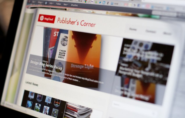
New Catalog Template

Looking for ways to showcase your growing line of products or services?  We have added a new catalog template to our free template collection.

This multi-page template is for Adobe InDesign users and is perfect for product or service brochures.  We’ve created a sample publication using this template to show you how easy it is to make a great looking catalog that is MagCloud-ready.

If you are new to using Adobe InDesign to create MagCloud-ready publications make sure to download our Adobe InDesign Getting Started Guide for tips on settings for trim, bleeds, image resolution and more.

Let us know what you think of the new template in our comments section below.

5 Catalog Design Essentials for Your Business

If you have a small business with a large product or service offering, odds are you have a catalog, and if you don’t, then you’ve probably wanted to create one, but didn’t know where to start. The process can be daunting–with so many elements to pull together and all sorts of design options to consider. So to help you get started, we’ve made a list of 5 tips to keep your efforts and design on track.

1. Know Your Audience

When choosing a design for your catalog, keep in mind your audience and appeal to their style, interests and demographics. Creating a sense of lifestyle will help you connect with customers and position your product as an object of their desire.

2. Reflect Your Brand

Keep your catalog style consistent with your brand style. You want to be sure they can make a connection between your website, logo, and service/products and your catalogs. Whatever you do, design with your brand in mind and be sure the voice and design of the catalog matches the voice and design of your brand. Once you have established a successful look-and-feel for your catalog, resist the temptation to change it. Repetition builds brand recognition, favorable reception and sales.

3. Use Quality Photography

All images should be of the highest quality possible. Make sure your pictures are clear and vivid, not pixilated. Poor quality images will send the message that the products are low quality. If you can’t afford to hire a professional photographer, read up on blogs and forums for great tricks for taking your own product photos. Also try to mix up the type of shot. Catalogs benefit from pacing and surprise – simple silhouetted images, closeups of details, wide angles, full-bleed photographs and lifestyle shots sustain viewer interest and keep them turning to the next page.

4. Space and Layout

The most important thing about a catalog is highlighting your product, so be sure you have ample white space for each item. Cramming text and images into a page, or using the exact same layout throughout the document will make it look stale and won’t encourage your customers to really pause and look over the whole spread. A consistent layout throughout the catalog enhances readability but can become boring, so be sure to break up the monotony of a predictable layout by including a unique page or two to highlight a favorite product or create an editorial opportunity for your customer to connect with the product.

5. Use fonts and color wisely

Be sure to use fonts that fit your brand’s style. If you have a children’s apparel brand, your typeface selections will be very different than if you have a luxury spa brand. Do not go overboard with typefaces, it’s probably best to limit your selection to just three. You can read more about this in our recent typography blog post.

Start Planning and Then Start Publishing

There aren’t any hard and fast rules for creating your catalog, just remember to keep it simple so that your product attracts more attention than your design. After all, the objective is to sell more, right?

A good starting point is to jott down words that come to mind when describing your brand: Is it whimsical? Sophisticated? Luxurious? Fun? These words will make the perfect litmus test as you assemble your catalog. Then every step along the way you can ask yourself, is this publication reflecting this image?

Now that you are ready to get started, take a look at some of the great examples of catalogs on MagCloud. We hope they will help inspire you. Already published a catalog with MagCloud? Share it below in the comments!


New Brochure Template for Adobe InDesign

Need a little help getting started creating your next brochure?  We have added a new brochure template to our free template collection.

This four page template is for Adobe InDesign users and is perfect for product or service brochures.  We’ve created a sample publication using this template to show you how easy it is to make a great looking brochure that is MagCloud-ready.

If you are new to using Adobe InDesign to create MagCloud-ready publications make sure to download our Adobe InDesign Getting Started Guide for tips on settings for trim, bleeds, image resolution and more.

Let us know what you think of the new template in our comments section below.

Portfolios Made Simpler With Flickr

Have you wanted to create a print portfolio for your photography, artwork or business but don’t have the design skills or the right software to get the job done?

Here at MagCloud we are always looking to make things easier for you, which is why we offer the option to create a print publication using a Flickr photoset. It’s easy to use, and in just a few minutes MagCloud will take a set of your photos on Flickr and lay them out in a simple one-image-per-page template to create a tidy portfolio. What’s great is that it works almost instantly and is very easy to use, so if you need to get a collection off to a potential client immediately, or have procrastinated and need to get something together quick–then this is the tool for you. Follow along with my example below, and give it a try for yourself.

Here’s how it works:

1. Upload your images to Flickr and organize them in a photoset.
Be sure to put the images in the order you wish for them to show in the portfolio. This means your first image will be your cover image, and then the rest will follow. Since each image will be assigned to a page, you will want to have a number that is an increment of 4 (that means 4, 8, 12, 16… etc). My set in this example has 36 images, so it will be 36 pages long.
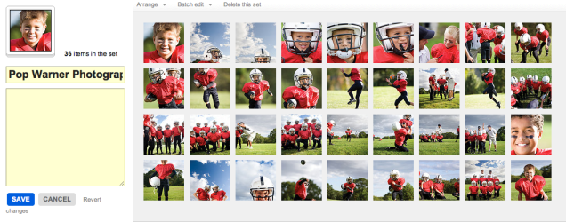
2. Edit the titles of your photos. (optional)
If you wish to include captions for your photos, such as credit information, location or other details, be sure to edit the titles of your photoset while in Flickr. You’ll have the option to include these titles at the bottom of each page of your final printed portfolio, so you could also use this space to include your contact information or copyright details.

3. Start the creation process at MagCloud.com/publish.
Once you are ready to publish, select the import from Flickr option on the Create Publication page. This will launch the importer, where you can select a photoset from your Flickr account.

4. Select your options and create your file.
The Title and Subtitle you enter here will appear on the cover of your publication. This is also where you can select whether you want to include photo titles and page numbers.

5. Preview your file and set binding options.
Take a quick look at your publication to confirm your settings. You can scroll through every page to see how your portfolio will look. Happy with it? Then select your binding options and publish!

6. You’re done!
See, now wasn’t that easy? Though this example is that of a children’s sports photographer, the Flickr Import could be used to make portfolios for your jewelry design business, fine art, architecture, decorating, crafts, or graphic design work. How you use it, is up to you.

A few tips and things to consider BEFORE you start your import:

What Image will be on my cover?
For simplicity, this should be the first image in your photoset.

What order do I want my images in?
The order that your images are in within your photoset, is the order they will appear in your MagCloud portfolio.

Which images will be facing on spreads?
If the first image in your set is the cover, then images 2 and 3 will be facing pages. It’s a good idea to go through your set to be sure that you like the arrangement of these photos (are people facing off the pages, or leaning against the outside edge of a page?) if so, you may want to swap around the order of your image.

Do I want to include captions or credits?
Because the title appears at the bottom of the page using this Flickr feature, you can also use this space for copyright information, or to include your contact information. In the examples below you can see how we accomplished this. To be sure every other page has the right information, just be sure to alternate the information in the titles of your images.

Is there any non-photographic content that I want to include like my contact information/ company logo?
To do this you have to get a bit tricky and create an image of the content and save it to flickr. You can use this trick to load verbiage into alternating pages, or if you want to include your company logo and contact information and logo on the back cover, this is a great work-around to do that. Simply create the image in any application that allows you to save an image (Flickr will let you upload JPEGs, non-animated GIFs, PNGs or TIFFs) and add it to your set.

What’s the maximum image size printed with the Flickr upload?
If you want to make sure your photo takes up as much of the page as possible, size it at 1875 by 2625 pixels at a minimum of 300 dots per inch resolution.

Are my images high enough resolution for printing?
The largest image size using the flickr uploader is 2475 by 2475 pixels on the covers and 1875 by 2625 pixels for interior images. For more information about photo quality and printing check out our blog post about getting the most out of your photos.

Can I have more than one photo on a page using the “Upload from Flickr” feature?
The “Upload from Flickr” feature currently only uses one photo per page. If you are adventurous, one way around this is to create a single image file (jpg, gif, png or tiff) that contains multiple photos and upload it as part of your Flickr set. Make sure the single image file is 1875 by 2625 pixels at a minimum of 300 dots per inch resolution. When your MagCloud publication is created, this file will be placed on a single page just like your other photos, creating the impression of multiple images on a single page like this example.

A Helping Hand

Need help creating or marketing your next publication?

Our Help section now includes a directory of templates, photography, design, advertising resources and more.  You can also find the the most popular design tips from our blog and latest How to Guides.

Still can’t find what you are looking for then visit the Ask MagCloud section to browse frequently asked questions about publishing, printing and shipping with MagCloud.

Our support team is also happy to answer any questions you can’t find answers for on our website.  Simply contact us so we can help you get the information you are looking for.

Know of a great resource that would help the MagCloud community?  Please drop us a line, we would love to hear about them.

Use MagCloud To Publish Your Portfolio

Today we begin a new blog series highlighting some of the great use cases we’ve seen people publish on MagCloud, along with design tips and inspiration to help you create your own publications. First up: portfolios.

On MagCloud we’ve seen portfolios that run the gamut from photography to fashion, architecture to interior design, music to floral arranging. With both print and digital options, uploading your portfolio to MagCloud is an easy way to spread the word about your work across a variety of mediums. With one PDF upload, you can have professionally printed books that you can send ahead or leave behind, as well as downloadable PDFs that can be displayed on any mobile device or computer.

When designing your portfolio PDF for MagCloud, a good starting point are the downloadable instruction packets on our Getting Started page for your software of choice. These step-by-step instructions will help you take your file from document setup to PDF export, and help ensure that your final publication matches MagCloud’s print specifications.

Once your file is set up, the next step is selecting your content. Since the goal of any portfolio is to highlight your work, for many industries, images will be the focal point of your content. When selecting your images, it’s important to remember to choose photos that are high enough resolution for printing, and ensure that your color profiles are embedded in your final PDF. Doing so will ensure the highest quality output of your images in print, setting a good foundation for the rest of your layout.

Which brings us to our next step, placing content in your document. When designing your portfolio layout, it’s good to determine what samples of your work you want to feature and then make that the focal point of each two-page spread. This will ensure that your work stays in the spotlight throughout the publication. If you will be using our perfect bound option, which provides a more professional look and feel with a square binding and thicker cover, don’t forget to check out our design tips for perfect binding when designing your layout to make sure you don’t lose any content into the spine.

We will be providing sources of inspiration throughout the series, but to encourage you to get something in hand to inspire your portfolio design sooner rather than later, we are lowering the production cost on print orders of the following well-designed MagCloud portfolios until the end of October:

Trey Hill Photography Annual: Issue 1: 2010” by Trey Hill
California Kitchens Now” by David Duncan Livingston
James Worrell Photographs: Make Up” by James Worrell

Have you published a portfolio showcasing your work on MagCloud? Share it in the comments below, and let us know what was most important to you when designing the publication. Then, stay tuned to the MagCloud blog as we continue this new series in the coming weeks with more design tips, sources of inspiration, and a few surprises.

MagCloud Blog Gets A Makeover

As you have probably noticed our blog also received a few updates today.

Our new design and layout is intended to make MagCloud news, tips and features easier to find and enjoy.

All posts are accessible via categories — Design Resources, Events, News, Publisher Spotlight, Tips and Tricks, and Trends.  Or you can search on a word or phrase to find related articles.

The blog has also become more social making it easier to share posts with friends and colleagues across your social network, as well as keep in touch with MagCloud.

Let us know what you think of our new blog design and if you have any suggestions in the comments section below.

Designing For Perfect Binding

After you upload your PDF to MagCloud, if it is over 24 pages you will have the option to select perfect binding for your print version. Although MagCloud uses the same PDF for saddle stitch and perfect bound publications, if you plan to choose perfect binding there are a few things that are good to keep in mind while you are designing your PDF.

Content Near The Spine
Saddle stitch binding allows your printed copy to lay flat when it is opened, allowing all content up to the inside edge of your PDF to be visible in the final print copy. Perfect bound publication are glued at the spine which results in approximately a quarter inch of the inside edge of your pages to be less visible because a perfect bound print cannot lie flat without breaking the spine. Therefore, it is good to account for an extra 0.25 inches of margin on the inside edge of your publication when placing text and images on the page, keeping in mind that anything within this 0.25 inches, also referred to as the gutter, may be lost into the spine in the final print.

Images Across Two-Page Spreads
The gutter can be troublesome when you want to place an image across the center spine of your publication. When an image covers two pages, the inside 0.25 inches on both pages will be obscured, which amounts to a half of an inch in the center of the image. This is enough to cause a full person to disappear in a larger group photo, or obscure a subject’s nose in a centered portrait. The best way to account for this is to shift the image outward on both pages so that it is duplicated inside the gutter (shown within the pink lines in the diagram below). Doing so will create the appearance of a continuous image across both pages in spite of the binding.

It’s also a good rule of thumb to avoid centering the focus of your image directly on or near the spine in a perfect bound publication. This disappearing act will be much less obvious if your eye isn’t drawn to it, as shown in the layout on the right versus the one on the left below.

Designing a Spine
Another design aspect to think about with perfect bound publications is the spine. After you upload your PDF to the MagCloud site and select perfect binding, you’ll have the option to pick a color for your spine or upload your own design. In either case, it’s a good idea to pick colors and designs for your spine that are the same or very close to the front and back covers of your publication. Just as the trim of your print copy can vary slightly, so can the placement of the spine, and this will be far more obvious if you have selected a white spine with a dark cover. Choosing a spine color that closely matches your cover or continuing an image from the front or back covers will ensure that your printed publication has a professional appearance every time.

Do you have a good-looking perfect bound publication design that you’d like to show off, or any tips of your own to share? Tell us about it in the comments below!

It’s All About the Wordplay: 6 Typeface dos and don’ts

We’ve all seen over-designed documents that at times make us cringe.

Most often the offending design element is an extreme font choice, or font overload with too many fonts used throughout the document. Poor typeface choices can make a document hard to read or unprofessional looking. So, if you are looking to keep a professional look, without compromising personality, it’s important to select the right fonts for your publication. And while there aren’t any hard/fast rules for selecting fonts, here are a few guidelines that we think may help you on your way.

1. Follow the Rule of 3
The only quantitative rule for design is the “Rule of 3.” When you start tweaking the fonts of your document, be sure to apply no more than three typefaces per design (or page). That’s not to say that you can’t use multiple styles within a font family (i.e. Neutra Bold for headlines and Neutra Thin for photo credits), just be mindful of not mixing too many typefaces and styles–fight the temptation to blend Impact, Courier, Lucinda and Trebuchet in the same document. While there might be a few exceptions to this rule, it’s a good sanity check, to ensure that you don’t go overboard and over-complicate your design. And as a good rule of thumb, you should probably just avoid Papyrus and Comic Sans. Always. Just take our word for it.

2. Choose a fitting font for your audience.
Be sure to choose a font that matches the tone and audience of your document. For example, Matt Mattus’ Plant Society a gardening blogazine has a different readership and “feel” than this corporate report. Both of these documents are well tailored to their target audience. Something like a gardening magazine might use a more fun and light serif font, whereas the business would find it more appropriate to use a more structured sans-serif font.

If all of this is sounding French to you, that’s because it is! In typography, serifs are the sometimes curly details (they look a bit like feet) on the ends of the strokes that make up letters and symbols. A typeface with serifs is called a serif typeface and a typeface without serifs is called sans-serif, from the French word sans, meaning “without.”

But enough with the French lesson, let’s take a look at some examples:

3. Avoid hard to read fonts.
Some decorative fonts are designed to only be used for headlines or even just drop caps. Be sure when you select a fancy or script font, that you use it sparingly, and that you can still read it. If you can’t read the type, you can be sure your audience won’t bother to try. Also avoid WordArt, which while fun to play with, is very difficult to read.

4. Use contrasting text for headlines and body text.
It’s important to define the segments of your document, breaking it up into bite-sized pieces so your reader is inclined to read it in its entirety. One way that you can do this is by clearly identifying headlines from your body paragraphs. For example, you might use a bold sans-serif heading font with a plain serif body text font. You generally don’t want to mix two similar typefaces as they won’t provide enough contrast.

5. Eliminate excessive emphasis in your text.
You should be able to emphasize the words without excessive use of bold, italic or underlines. As you are designing, zoom out and look at the page from a distance. If your text is littered with tons of bold segments, italics and underlines, you might want to rethink what you’re doing.

6. Be consistent.
Consistency is key to building a brand style, or just having a stronger, more professional-appearing message. If your headings are set in a particular font, size and color, don’t switch it midway through a document, unless you have a good reason for it. The best way to maintain consistency through a multipage document, or from document to document, is to set style sheets.

Each software program handles style sheets differently, so if you aren’t sure how to use them you may want to visit your software developer’s help section for a tutorial. Time spent learning how to use style sheets will be a great investment for your future designs.

Just remember to keep it simple.
When all is said and done, the important thing to remember is to keep it simple. And simple doesn’t have to mean boring, but instead discerning–keeping an editor’s eye on your design and font selections, so that your message doesn’t get lost in your design.

Do you have more typography suggestions? Share them below in the comments!

Working With Color

In the world of traditional printing, getting the right color in the right place on the page is something of an art form, done by overlapping layers of ink in just the right quantities using carefully positioned aluminum plates. In a digital world of backlit screens, color is a more technical process, using the spectrum of visible light to produce the desired color output. When these two worlds collide for digital printing, colors must undergo a transition from how they are displayed on screen to what gets printed on the page.

To help you design your MagCloud PDF so that this transition is as accurate as possible, first let’s get back to basics.

RGB vs CMYK
A lot of acronyms get thrown around when you start talking about color, the most common being RGB and CMYK.

RGB stands for Red-Green-Blue, and is an additive color model based on combining red, green and blue light, as shown in the color chart on the left below. RGB is the color model used by most digital devices, including your computer screen and the images produced by your digital camera.

RGB vs CMYK

CMYK stands for Cyan-Magenta-Yellow-Key (ie, black), and is a subtractive color model based on layering cyan, magenta, yellow and black ink to selectively subtract the amount of light reflected off the page, as shown in the color chart above right. CMYK is also commonly referred to as 4-color process, and is the color model used for color printing both on traditional presses and on the HP Indigo digital presses used to print MagCloud publications.


From An RGB Monitor To A CMYK Print Copy

When your MagCloud PDF is sent to an HP Indigo digital press for printing, the press will convert any non-CMYK content to CMYK prior to printing. The press does this conversion automatically based on the color profiles that have been embedded in your file. If there are no color profiles embedded in your file, this conversion will be based on the default color settings of the press, which could result in a color output that is different from what you see on screen.

Therefore, to ensure you get the best output possible, we encourage you to follow these color guidelines when creating and inserting content in your MagCloud PDF:

• Images you place into your document, whether from a digital camera or stock photography website, should be left in their original color space (sRGB, Adobe RGB, etc) with the corresponding color profiles embedded in the final PDF.*

• Text and other vector components (ie, backgrounds, blocks of color, etc) that you create in the document should be CMYK, with black text set to 100% K (CMYK = 0, 0, 0, 100).

*For specific information about embedding color profiles in your design program of choice, be sure to check out our Getting Started page.

Have any other color tips to share from your MagCloud publishing experience? Let us know in the comments below!