A Few Inspirations For Your Portfolio

As mentioned in our blog series, MagCloud is here to help publish your portfolio and provide options to create a big impression with a small format. So what’s the next step? We thought we’d offer a few examples to inspire you to start or update your existing portfolio. Portfolios are critical for designers, photographers and other small business owners who want to get exposure for their work and land new clients.

Whether you’re a musician, watercolor painter or even a blacksmith, you can capture a moment of creativity by browsing through more than 300 portfolios already on MagCloud. Draw additional inspiration from portfolios of other notable interior designers, graphic designers, and architects. Below are a few more examples of what your fellow publishers have been working on.

This collection of artist’s portfolios is a great example of using our digest format. For those conscious about budgets and the size of your portfolio, digest size provide an efficient way to share your best work in both print and digital formats.

As a small business, Sweet Pea Floral Creations showcases some of their favorite floral arrangements and highlights from client events and weddings.

Just graduated? Compile your best work for a great supplement to your resume, just like this advertising creative portfolio that Lauren Richer created.

Interior and architectural photographer David Duncan Livingston created various portfolios of his clean, welcoming photographs of homes, hospitality and products.

Below is a run-down of additional photography print portfolios that have caught our eyes.

  • The Art of Enzo Mondejar features an avant-garde take on portraiture by the gifted photographer, Enzo Mondejar. The images are creatively captivating and we hope they offer some inspiration for your print portfolio.
  • Nevertheless is the creative output of Peter Olschinsky, Verena Weiss and Gerhard Weib. This gorgeous layout design can teach us all more about how to present our images in the best light and perspective.
  • Finally, the Lolli POP Project is the work of photographer Massimo Gammacurta and is a great example of letting color explode onto a printed page and take off. Featured in Wired Magazine in December 2010, this project is both eye-catching and salivating.

What other portfolios have you seen that help inspire you to create your own? Share them with us in the comments below.

Make a Big Impression in a Smaller Package

Continuing our series on publishing your portfolio through MagCloud, today we take a look at a few design ideas for using the new Digest product to present your work in a more compact format. Digest publications provide the same professional image quality and finishing you’ve always gotten with MagCloud, but with a trim size of 5.25″ wide by 8.25″ tall, they take up only about half the space in your bag. Plus with a cheaper price point (16 cents per page) you can stretch your budget a bit further, and get your work into the hands of even more potential customers.

The question is, how to design within this more constrained space and still highlight your work? To help you get started, we’ve listed a few ideas below…

Use Both Pages

Take full advantage of the available space with images of your work spanning both pages, and bleeding off the trim edges. If you are going to be opting for perfect binding and want to place your images across the spine, be sure to check out our tips for designing for perfect binding.

Highlight One Piece of Work Per Page

Place one image per page to create a kind of photobook. This format is particularly conducive to lookbooks for fashion collections, with each page containing one look.

Combine Images and Text Across a Spread

Make a photo of your work the focus of one page, either with a full bleed or as a contained image, and then include descriptive text on the opposing page. This way each spread focuses on one project, combining both imagery and text to tell the story of each piece of work.

Think Outside Portrait Orientation

Until we are able to offer a true landscape product, show off your work in a landscape format by rotating your content 90 degrees, such that the spine of the publication is on the top edge of the page. If you want to add some practically to your portfolio, and ensure it gets kept around for the coming year, use this rotated format to make a mini calendar, with each month highlighting a different piece of past work.

Create a Themed Booklet with a Segment of Your Work

When photographer Trey Hill learned about our new Digest format, he used it to combine a collection of his images into a photo story called Untouchable. These are images that are included as part of his larger 2010 Photography Annual, but the smaller form factor offers a more focused look at the story this series of photos tells. See for yourself how Trey has used this smaller format to tell his photo story: we’re taking 25% off the production costs on all print orders of Untouchable from now until the end of October.

Have you had a chance to experiment with our new Digest format to create your portfolio? Let us know in the comments what your design strategy has been.

Use MagCloud To Publish Your Portfolio

Today we begin a new blog series highlighting some of the great use cases we’ve seen people publish on MagCloud, along with design tips and inspiration to help you create your own publications. First up: portfolios.

On MagCloud we’ve seen portfolios that run the gamut from photography to fashion, architecture to interior design, music to floral arranging. With both print and digital options, uploading your portfolio to MagCloud is an easy way to spread the word about your work across a variety of mediums. With one PDF upload, you can have professionally printed books that you can send ahead or leave behind, as well as downloadable PDFs that can be displayed on any mobile device or computer.

When designing your portfolio PDF for MagCloud, a good starting point are the downloadable instruction packets on our Getting Started page for your software of choice. These step-by-step instructions will help you take your file from document setup to PDF export, and help ensure that your final publication matches MagCloud’s print specifications.

Once your file is set up, the next step is selecting your content. Since the goal of any portfolio is to highlight your work, for many industries, images will be the focal point of your content. When selecting your images, it’s important to remember to choose photos that are high enough resolution for printing, and ensure that your color profiles are embedded in your final PDF. Doing so will ensure the highest quality output of your images in print, setting a good foundation for the rest of your layout.

Which brings us to our next step, placing content in your document. When designing your portfolio layout, it’s good to determine what samples of your work you want to feature and then make that the focal point of each two-page spread. This will ensure that your work stays in the spotlight throughout the publication. If you will be using our perfect bound option, which provides a more professional look and feel with a square binding and thicker cover, don’t forget to check out our design tips for perfect binding when designing your layout to make sure you don’t lose any content into the spine.

We will be providing sources of inspiration throughout the series, but to encourage you to get something in hand to inspire your portfolio design sooner rather than later, we are lowering the production cost on print orders of the following well-designed MagCloud portfolios until the end of October:

Trey Hill Photography Annual: Issue 1: 2010” by Trey Hill
California Kitchens Now” by David Duncan Livingston
James Worrell Photographs: Make Up” by James Worrell

Have you published a portfolio showcasing your work on MagCloud? Share it in the comments below, and let us know what was most important to you when designing the publication. Then, stay tuned to the MagCloud blog as we continue this new series in the coming weeks with more design tips, sources of inspiration, and a few surprises.

Designing For Perfect Binding

After you upload your PDF to MagCloud, if it is over 24 pages you will have the option to select perfect binding for your print version. Although MagCloud uses the same PDF for saddle stitch and perfect bound publications, if you plan to choose perfect binding there are a few things that are good to keep in mind while you are designing your PDF.

Content Near The Spine
Saddle stitch binding allows your printed copy to lay flat when it is opened, allowing all content up to the inside edge of your PDF to be visible in the final print copy. Perfect bound publication are glued at the spine which results in approximately a quarter inch of the inside edge of your pages to be less visible because a perfect bound print cannot lie flat without breaking the spine. Therefore, it is good to account for an extra 0.25 inches of margin on the inside edge of your publication when placing text and images on the page, keeping in mind that anything within this 0.25 inches, also referred to as the gutter, may be lost into the spine in the final print.

Images Across Two-Page Spreads
The gutter can be troublesome when you want to place an image across the center spine of your publication. When an image covers two pages, the inside 0.25 inches on both pages will be obscured, which amounts to a half of an inch in the center of the image. This is enough to cause a full person to disappear in a larger group photo, or obscure a subject’s nose in a centered portrait. The best way to account for this is to shift the image outward on both pages so that it is duplicated inside the gutter (shown within the pink lines in the diagram below). Doing so will create the appearance of a continuous image across both pages in spite of the binding.

It’s also a good rule of thumb to avoid centering the focus of your image directly on or near the spine in a perfect bound publication. This disappearing act will be much less obvious if your eye isn’t drawn to it, as shown in the layout on the right versus the one on the left below.

Designing a Spine
Another design aspect to think about with perfect bound publications is the spine. After you upload your PDF to the MagCloud site and select perfect binding, you’ll have the option to pick a color for your spine or upload your own design. In either case, it’s a good idea to pick colors and designs for your spine that are the same or very close to the front and back covers of your publication. Just as the trim of your print copy can vary slightly, so can the placement of the spine, and this will be far more obvious if you have selected a white spine with a dark cover. Choosing a spine color that closely matches your cover or continuing an image from the front or back covers will ensure that your printed publication has a professional appearance every time.

Do you have a good-looking perfect bound publication design that you’d like to show off, or any tips of your own to share? Tell us about it in the comments below!

It’s All About the Wordplay: 6 Typeface dos and don’ts

We’ve all seen over-designed documents that at times make us cringe.

Most often the offending design element is an extreme font choice, or font overload with too many fonts used throughout the document. Poor typeface choices can make a document hard to read or unprofessional looking. So, if you are looking to keep a professional look, without compromising personality, it’s important to select the right fonts for your publication. And while there aren’t any hard/fast rules for selecting fonts, here are a few guidelines that we think may help you on your way.

1. Follow the Rule of 3
The only quantitative rule for design is the “Rule of 3.” When you start tweaking the fonts of your document, be sure to apply no more than three typefaces per design (or page). That’s not to say that you can’t use multiple styles within a font family (i.e. Neutra Bold for headlines and Neutra Thin for photo credits), just be mindful of not mixing too many typefaces and styles–fight the temptation to blend Impact, Courier, Lucinda and Trebuchet in the same document. While there might be a few exceptions to this rule, it’s a good sanity check, to ensure that you don’t go overboard and over-complicate your design. And as a good rule of thumb, you should probably just avoid Papyrus and Comic Sans. Always. Just take our word for it.

2. Choose a fitting font for your audience.
Be sure to choose a font that matches the tone and audience of your document. For example, Matt Mattus’ Plant Society a gardening blogazine has a different readership and “feel” than this corporate report. Both of these documents are well tailored to their target audience. Something like a gardening magazine might use a more fun and light serif font, whereas the business would find it more appropriate to use a more structured sans-serif font.

If all of this is sounding French to you, that’s because it is! In typography, serifs are the sometimes curly details (they look a bit like feet) on the ends of the strokes that make up letters and symbols. A typeface with serifs is called a serif typeface and a typeface without serifs is called sans-serif, from the French word sans, meaning “without.”

But enough with the French lesson, let’s take a look at some examples:

3. Avoid hard to read fonts.
Some decorative fonts are designed to only be used for headlines or even just drop caps. Be sure when you select a fancy or script font, that you use it sparingly, and that you can still read it. If you can’t read the type, you can be sure your audience won’t bother to try. Also avoid WordArt, which while fun to play with, is very difficult to read.

4. Use contrasting text for headlines and body text.
It’s important to define the segments of your document, breaking it up into bite-sized pieces so your reader is inclined to read it in its entirety. One way that you can do this is by clearly identifying headlines from your body paragraphs. For example, you might use a bold sans-serif heading font with a plain serif body text font. You generally don’t want to mix two similar typefaces as they won’t provide enough contrast.

5. Eliminate excessive emphasis in your text.
You should be able to emphasize the words without excessive use of bold, italic or underlines. As you are designing, zoom out and look at the page from a distance. If your text is littered with tons of bold segments, italics and underlines, you might want to rethink what you’re doing.

6. Be consistent.
Consistency is key to building a brand style, or just having a stronger, more professional-appearing message. If your headings are set in a particular font, size and color, don’t switch it midway through a document, unless you have a good reason for it. The best way to maintain consistency through a multipage document, or from document to document, is to set style sheets.

Each software program handles style sheets differently, so if you aren’t sure how to use them you may want to visit your software developer’s help section for a tutorial. Time spent learning how to use style sheets will be a great investment for your future designs.

Just remember to keep it simple.
When all is said and done, the important thing to remember is to keep it simple. And simple doesn’t have to mean boring, but instead discerning–keeping an editor’s eye on your design and font selections, so that your message doesn’t get lost in your design.

Do you have more typography suggestions? Share them below in the comments!

Working With Color

In the world of traditional printing, getting the right color in the right place on the page is something of an art form, done by overlapping layers of ink in just the right quantities using carefully positioned aluminum plates. In a digital world of backlit screens, color is a more technical process, using the spectrum of visible light to produce the desired color output. When these two worlds collide for digital printing, colors must undergo a transition from how they are displayed on screen to what gets printed on the page.

To help you design your MagCloud PDF so that this transition is as accurate as possible, first let’s get back to basics.

RGB vs CMYK
A lot of acronyms get thrown around when you start talking about color, the most common being RGB and CMYK.

RGB stands for Red-Green-Blue, and is an additive color model based on combining red, green and blue light, as shown in the color chart on the left below. RGB is the color model used by most digital devices, including your computer screen and the images produced by your digital camera.

RGB vs CMYK

CMYK stands for Cyan-Magenta-Yellow-Key (ie, black), and is a subtractive color model based on layering cyan, magenta, yellow and black ink to selectively subtract the amount of light reflected off the page, as shown in the color chart above right. CMYK is also commonly referred to as 4-color process, and is the color model used for color printing both on traditional presses and on the HP Indigo digital presses used to print MagCloud publications.


From An RGB Monitor To A CMYK Print Copy

When your MagCloud PDF is sent to an HP Indigo digital press for printing, the press will convert any non-CMYK content to CMYK prior to printing. The press does this conversion automatically based on the color profiles that have been embedded in your file. If there are no color profiles embedded in your file, this conversion will be based on the default color settings of the press, which could result in a color output that is different from what you see on screen.

Therefore, to ensure you get the best output possible, we encourage you to follow these color guidelines when creating and inserting content in your MagCloud PDF:

• Images you place into your document, whether from a digital camera or stock photography website, should be left in their original color space (sRGB, Adobe RGB, etc) with the corresponding color profiles embedded in the final PDF.*

• Text and other vector components (ie, backgrounds, blocks of color, etc) that you create in the document should be CMYK, with black text set to 100% K (CMYK = 0, 0, 0, 100).

*For specific information about embedding color profiles in your design program of choice, be sure to check out our Getting Started page.

Have any other color tips to share from your MagCloud publishing experience? Let us know in the comments below!

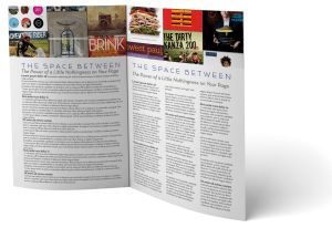
The Space Between

No matter what sort of document you’re planning to publish through MagCloud, it’s important to understand the role that white space plays in your design’s aesthetics.

White space, also known as negative space, is the unused space between text and graphic elements within a publication. It gives the eye a place to land and rest, and implies significance to the content you place on a page.  Some would argue that this empty space is as important as the text and graphic images of a page and that it can make, or break a design. So let’s explore why it’s so important.

Balance and Harmony in Print Design
White space is an integral element of design, as it enables a state of balance to exist between the design objects. It also plays an active role in the effectiveness of a layout; it can highlight important elements and support the overall hierarchy, leading the viewer around the page as the designer intended. The empty space on a page can be every bit as important as the space occupied by graphic elements, and thoughtful use of white space can give a page a timeless, tasteful, and professional appearance.

Check out this example below of a Small Business Brochure that has been reworked to better showcase their photography while still including valuable messaging.

Balance and Harmony in Print Design
Give your photos room to breathe. Highlighting photography doesn’t mean you have to fill a page edge-to-edge with your image. Leaving empty space near an image leaves room for the consumer to pause and use their imagination beyond the frame. The second layout has the same written content, and even had room for a 3rd photo.
 

De-clutter Your Page to Get Your Message Across
Clutter on a page is a lot like clutter in a room–it’s distracting and can overwhelm you, or in this case can overwhelm your reader. But when space is at a premium, white space is often abandoned in order to get as much information on the page as possible. It’s important to keep in mind that a page crammed full of text or graphics with very little white space runs the risk of seeming busy, cluttered and in turn difficult to read. It can also cheapen the overall image you are trying to portray.

Large blocks of text, with little breathing room, tire the eyes much more quickly than those that are adequately spaced with healthy kerning (spacing between characters) and leading (spacing between lines of text). A crowded layout runs the risk of being overlooked by readers simply because it puts strain on their eyes, and in turn, their patience.

With that in mind, when you are designing your next publication, keep in mind a goal of making the end viewing experience as easy and pleasant for your readers as possible. Just like you would tidy your house for guests, de-clutter your pages to make them inviting for your readers, helping them feel more relaxed and encouraging them to spend time lingering over your content.

Use White Space to Convey Your Message
Step away from the edge. Asymmetry and putting content on the margin, when done deliberately, can have a powerful effect on the reader, but when overdone, it can leave the reader feeling on edge. Text that gets too close to the edge of a page can leave the reader feeling like they are going to fall off the page. What’s worse? If you play it too close, content could get trimmed off during the binding process. In this example above, we re-worked the layout and narrowed the columns to make it easier to read.
 

Focus on the Negative, Just This Once
There aren’t many situations in life where focusing on the negative is a good thing, but when it comes to print design, you’ll find it can lead to positive results. Take a look through your favorite magazines to see which designs strike a chord with you more frequently. Chances are, you’ll notice a theme. You may start to notice that highlighting and separating text and graphics with white space imparts more value to content.

After you’ve explored other print designs with this focus on the negative space, be sure to revisit some of your own designs, we’re sure you’ll find ways to tidy up and balance your content with a little more breathing room.

Focus on the Negative
Which would you rather read? When dealing with text-heavy content, you don’t need to fill the page from margin to margin with tiny, single-column text. Take a step back and look at the page from afar. Does the content look digestible? Ask yourself “Would I want to read that?” Narrower columns are easier to read than wide ones that span an entire page. 
 

Get Inspired by Other MagCloud Publishers
For more great examples, check out these MagCloud publishers who really know how to use white space to their advantage:

Hacker Monthly
Snapixel Magazine
Stumble

Think you have an exemplary use of white space in your MagCloud publication?
Share it in the comments section below!

Get The Most Out Of Your Images

They say a picture is worth a thousand words, but if that picture is grainy or squished, it’s not going to be saying anything good. To help you include images that speak volumes in your next MagCloud publication, this installment of our Design Blog Series includes a short list of image DOs and DON’Ts:

DON’T use images copied off a website
Aside from the potential copyright issues associated with taking images off of websites, photos used on the web are almost always screen resolution, or 72 pixels per inch (ppi, or more commonly, dpi). This is roughly a quarter of the 300 pixels per inch that is the recommended resolution for printing. If you use an image less than 300 dpi in your MagCloud publication, you run the risk of getting a noticeably pixelated, or ‘fuzzy-looking’ image in the print copy.  The lower the resolution of your image, the more noticeable the pixelation will be, so a 72 dpi image off the internet will look very ‘fuzzy’ in print.

DO use images from your camera or stock photography websites
Images taken with a personal camera or purchased from a stock photography website like iStockphoto will generally be high enough resolution for printing.

An easy way to check if your images are high enough resolution for printing is to open your final PDF and zoom in to 350% on-screen. If an image still looks clear at 350% zoom, like the 300 dpi image on the below left, then this image will look great in your printed copy. If an image looks pixelated at 350%, like the 72 dpi image shown below right, then it will likely look pixelated in your print copy too.

300 dpi vs 72 dpi at 350% zoom

It’s also good to keep in mind that if you double the size of an image, the number of pixels per inch will drop by half. This is because doubling the size of an image doesn’t change the number of pixels in the image, it just increases the number of inches that the pixels have to fill. For example, if you have a 1” x 1” 300 dpi image, which is 300 pixels by 300 pixels, doubling it in size to 2” x 2” means that there are now 300 pixels for every 2 inches, making it a 150 dpi image.

DON’T squish or stretch your images
You have a rectangular photo, let’s say 4” x 6”, but you want it to be square in your MagCloud publication. Sound familiar? One solution would be to just squish or stretch the rectangular image into the square size you want, but here is the inevitable result:

Stretched/Squished Example

DO scale and crop your images
To avoid squishing and stretching the subjects of your photos, the better option is to use scaling and cropping to resize your images. Scaling your images maintains their aspect ratio (the ratio between the width and height of the image), keeping a rectangular image as a rectangle, then the image can be cropped (i.e trimmed) down to the size you want, like so:

Scale/Crop Example

In Adobe InDesign, QuarkXpress, Microsoft Publisher and Apple Pages, you can crop images by creating an image placeholder in the size you want, and then placing your image into the placeholder. These programs allow you to adjust the image independently of the placeholder, and the placeholder will “crop” the image in your final publication. In Microsoft Word and Microsoft Publisher, you can use the Crop Picture feature to manually crop the image itself down to the size that you want. Both methods will help you avoid stretching or squishing your subjects.

DON’T use images that are really dark with low contrast

Your computer screen is brightly back-lit, but unfortunately print publications are not. As a result, details that are dark or low contrast on screen may not be as visible in your printed copy. Overall, you can expect the print you receive to appear darker than what you see on screen, so it’s best to avoid using darker images or those with very low contrast to begin with. If you want to try lightening or increasing the contrast in your images in a photo editing software like Photoshop, check out these photo retouching tips and tricks.

DO embed your color profiles

To get the closest representation in your print copy as compared to what you see on screen, make sure that you embed the original color profiles of your images in the final PDF. We’ll dive more into detail on this next week in a post on color, but in the meantime check out our Getting Started page for downloadable instructions on how to do this in your design program of choice.

We would love to hear your favorite tricks for getting your images to standout. Please post them in the comments section below.

Trim, Bleed and All That Jazz

One of the trickiest things about designing for print is understanding trim size and all things related to it.

After the printed pages come off our presses and are bound together, they need to be “trimmed” so that each page is exactly the same size.  This ensures each page in your publication is even, giving it that professional look.

While we always try to trim as accurately as possible, it’s natural for the trim line to vary slightly in one direction or the other, which is why we recommend that you include a “bleed” and work within a “safe zone” when you design your PDF.

Bleed

To ensure that no important parts of the page are cut off in the trimming process a “bleed” area is defined.  The “bleed” extends beyond the “trim” for when you want a photo or color to extend to the edge of the page.  For Standard, Digest, and Digest Landscape publications, the bleed is the top 0.125 inches, the bottom 0.125 inches, and the outside 0.25 inches of your PDF. For Flyer publications, the bleed is the 0.125 inches on all sides of the 8.5″ x 11″ PDF.

The reason to include a bleed in print files is to ensure that images you want to go to the edge of the page always do so, regardless of how exact the trim is.  If an image is cropped at the 8.25” x 10.75” trim edge on a Standard size publications, as shown in the below diagram on the left, and the print is trimmed slightly wider, then there will be a white bar between the printed image and the edge of the page.  If the image is extended all the way to the 8.5” x 11” PDF edge instead, filling the bleed area as shown in the below diagram on the right, then the printed image will go all the way to the edge of the page regardless of where the actual trim occurs.

Safe Zone

The “safe zone” is the area inside the trim line where your text and graphics are not at risk of being cut off or lost into the binding in the final print, regardless of any variation in the trim.  For MagCloud publications this area is 0.25 inches within all sides of the trim edge.

Any content that you want to appear completely within the final printed publication should be kept inside the safe zone.  Placing content too close to the top, bottom or outside edge of the PDF could result in that content being cut off during trimming.  This is something to keep in mind when adding page numbers to your publication, as those tend to be placed closer to the page edge.  Similarly, placing content too close to the inside edge of the PDF could result in that content being lost into the binding if your publication is perfect bound.  By keeping your content within the safe zone, you ensure that it will appear completely in the final print and digital copies of your publication.

For more information and step-by-step instructions to set up your PDF with the bleed and safe zone in mind be sure to check out our Getting Started page.

Next up in the MagCloud Design series: The Importance of Layouts and Templates

Design Blog Series

We realize designing a great looking publication can be time-consuming and a bit tricky so for the next month we’ll be doing a series of blog posts sharing some of the MagCloud team’s favorite design tips and resources.

These will range from guidance on how to create a MagCloud-ready PDF, to design do’s and don’ts, as well as the latest trends in fonts, color and content layout.

Tomorrow we’ll kick off the series with a post on how to work with trim size when creating a MagCloud-ready PDF.

Let us know in the comments section if there are any specific topics you would like us to include in the Design Blog Series.

Happy Designing!